Fit gets all the credit in style talk, and it deserves most of it. But the first thing anyone actually clocks about an outfit is colour. Long before the cut of a trouser or the texture of a jacket registers, the shades are already doing the talking.
So which shades are doing the talking this time around? I’ve spent the last six years reading runways, street style and retail data to predict what sells, and the summer 2026 signal is quiet. The bright, saturated palette of the previous season is receding. What’s replacing it: seven grounded tones with just enough contrast to look deliberate rather than safe. Worth your attention? Yes. Loud? No, and that’s exactly the point.
Here’s the palette, and how to actually wear each one.
Olive
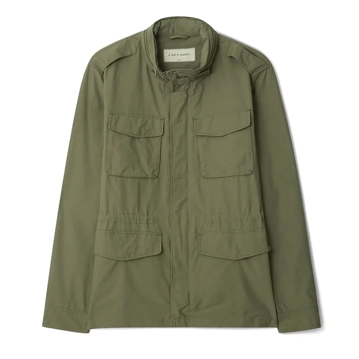
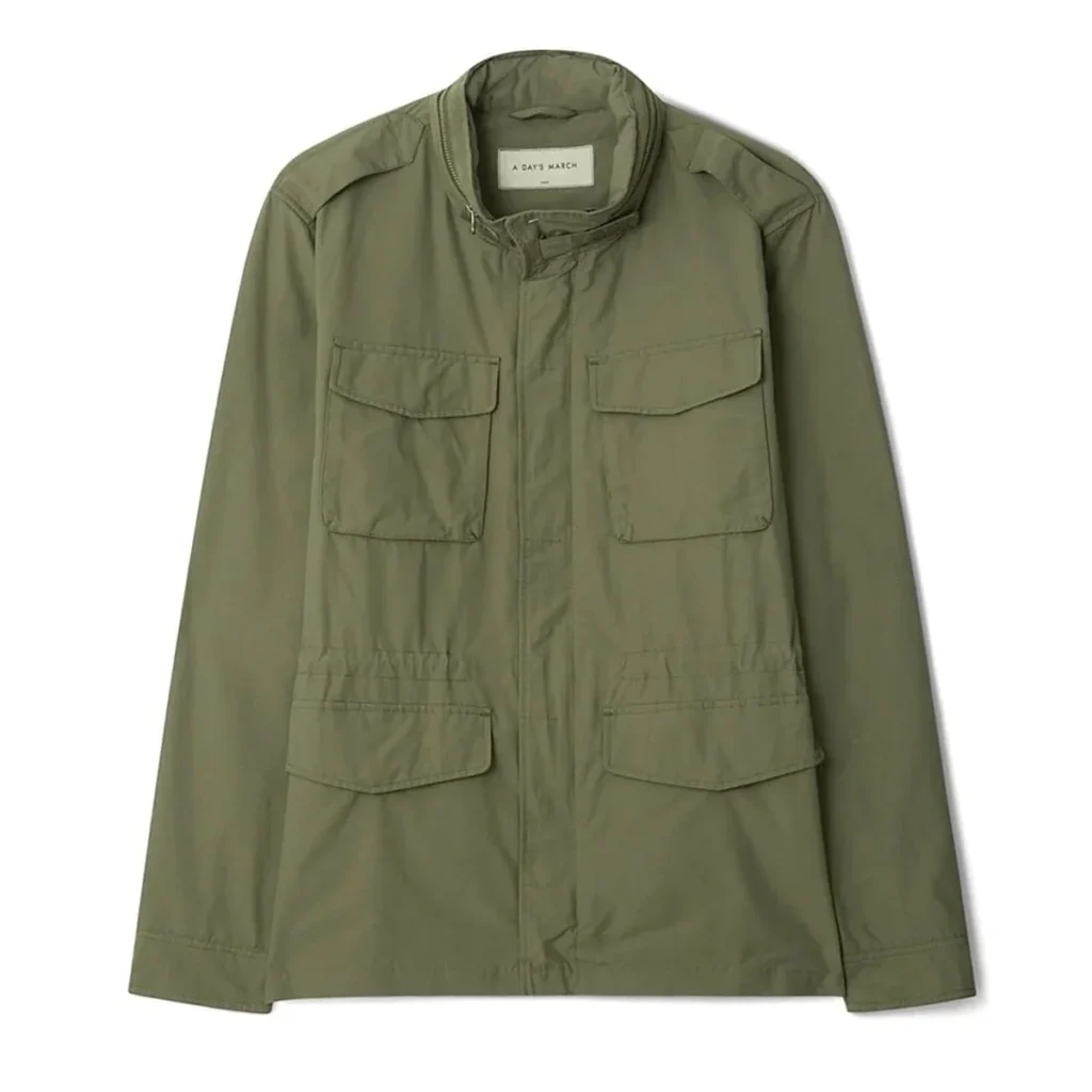
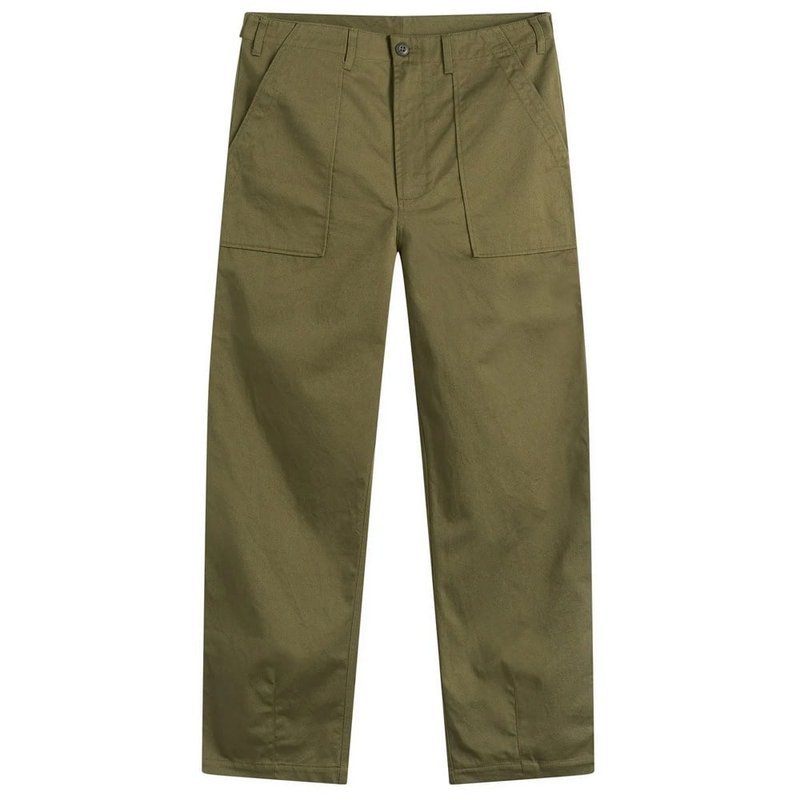
Olive is the anchor of this palette. A true seasonless colour, it does the job of black or charcoal in a warm-weather wardrobe without the heat penalty. In summer it echoes the landscape it was borrowed from, and it wants to live on anything with a utilitarian lean or a bit of texture. Fatigue trousers, an overshirt, a field jacket, a linen shirt. The bar is simple: if the piece looks like it could have come out of a workshop somewhere, olive will make it look intentional.
One more reason to clock it: olive doesn’t discriminate between warm and cool undertones. That’s rare for a dark neutral, and worth remembering when a colleague’s jacket from two summers ago suddenly looks sharper than yours.
Verdict: radar keeper. Buy the field jacket first if you want one piece that carries you from now through September.
Tobacco
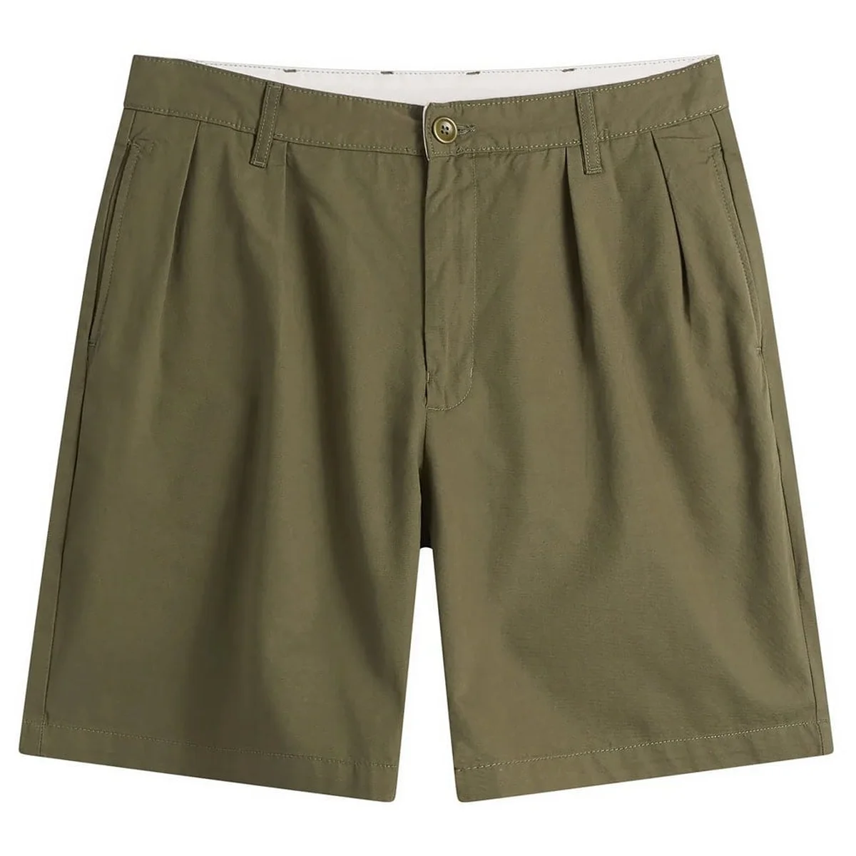
Tobacco sits somewhere between tan and caramel, and it plays richness without the heaviness a darker brown would bring. It complements natural materials particularly well — linen, suede, leather. In summer, tobacco is mostly an accessories and footwear colour rather than a top colour. Suede loafers, soft tailoring, leather sandals, one good belt. A single piece in this shade makes the rest of the outfit look considered.
For skin tone: it leans toward warm complexions, olive skin and dark hair. Fairer skin can still pull it off if you balance with off-white or ecru, and once you’ve picked up a tan the gap narrows quickly.
Verdict: worth it as an accessory, not as a head-to-toe base. One belt, one pair of loafers, done.
Chocolate
Black still works, but in the heat of high summer it can feel a bit stifling. Chocolate is the softer, more relaxed alternative. Same depth, same versatility, but it breathes better when cut in linen, lightweight cotton or seersucker. Think a knit polo on a warm evening, tailored shorts in the toast side of brown, loafers where the colour’s depth emphasises the texture that’s already there.
Medium to darker complexions wear this shade most naturally, but fairer skin tones can wear it just as well by pairing it with ecru, white or butter yellow.
Verdict: the summer version of the black you already own. One knit polo earns its cost-per-wear quickly.
Butter yellow
After years of loud citrus tones and neon accents, butter yellow is the shade in that family that actually survives. Gentle, warm, understated. It reflects light without shouting at you, and it adds personality to a neutral wardrobe without being all ‘Ooh, look at me’ about it. That’s what makes it one of the easiest ways to introduce colour into an otherwise quiet outfit.
It’s also surprisingly wearable thanks to its muted nature. Butter yellow complements most skin tones — fairer ones included once you have a bit of a tan — and it looks best worn close to the face. Oxford shirts, linen shirts, heavyweight T-shirts, knit polos. Pair it with olive, chocolate or navy for a failsafe summer combination.
Verdict: worth it as a single test case. If you haven’t worn a pastel since degrees season, start here and see how it sits for a few days before you decide.
Sage
If summer had an official shade of green, it would be sage. Cool, muted, slightly dusty. It sits between olive and celadon, and it carries the grey undertones that keep it from tipping into saturation. It’s one of the easiest greens to wear because it doesn’t demand a full commitment, which is exactly what most people need from a colour trend.
Sage works on almost everyone, and it really comes into its own against tanned skin. Lightweight shirts, camp collars, swim shorts, a cap. Pair it naturally against ecru or tobacco, or wear it tonally alongside other earthy neutrals.
Verdict: worth it if you haven’t worn a green in a couple of seasons.
Ecru
Ecru is the thinking man’s white. Warmer, softer against the skin and far more forgiving in hard light than brilliant white, while doing a better job of highlighting the texture of natural fabrics like linen, cotton and denim. It suits virtually every complexion and works across almost every garment category: jeans, tailored trousers, knitwear, overshirts, a plain crew-neck T.
Better still, it acts as the perfect backdrop for almost every other colour on this list. If you’re looking for a foundation colour to build your summer wardrobe around, this is it.
Verdict: the foundation piece. Buy first.
Cobalt blue
Not every summer colour has to whisper. Cobalt blue is the only shade on this list that earns attention loud, and it does so without looking like it’s trying. Deep Mediterranean water, clear skies, hand-painted coastal ceramics — that’s the reference image. Against the neutrals it stands out hard, but against other brights it disappears entirely, so you’ll want to keep it quiet.
The mistake is building an entire outfit around it. Do the opposite: one key piece, an overshirt, a lightweight knit, a pair of swim shorts, and ground it with ecru, white or chocolate. It becomes the single visual interest inside a simple outfit, which is the whole trick.
Trend Signal
Signal: the grounded shift. The palette is moving away from bright citrus and neon accents toward earthy neutrals — tobacco, chocolate, sage, ecru — with cobalt as the single accent the radar keeps finding across showrooms. The follow is simple: one overshirt in olive, one suede belt in tobacco, one T in ecru, one knit in chocolate. Four pieces, four shades, and you’ve got a working summer wardrobe without buying a single extra item beyond what you’ve already planned.
Worth it or skip it: worth it if you follow it with restraint. Follow for one echo per outfit. Skip: anything in the acidic, neon-leaning shades that seems to be last season’s stock still sitting in racks. If I had to donate one trend from last summer, it would be the neon accent — this year’s cobalt and chocolate do the same job without the effort.
FAQ
Do all seven shades work for my skin tone?
Olive and sage work on pretty much everyone and carry the most weight. Chocolate and tobacco lean warmer — fairer complexions keep them wearable by buffering with ecru or butter yellow. Ecru is safe as a base anyway. Cobalt is an accent, so it works independently of complexion.
Which piece should I buy first?
Ecru base, or the sage piece at your price point, whichever you can get. One neutral, one saturated. You can wear them together and separately against everything you already own.
Do I need all seven shades?
No. The palette is a toolkit, not a required set. Take the two or three that fit what you already wear, skip the rest. A capsule is a toolbox, not a museum.
A note from Sophie
I keep reminding myself that the trend I follow hardest is the one I skip least often. If you take only one thing from this list, take the ecru base and one sage piece. Everything else can wait until you see how those two sit in a working day’s outfits. That’s how you follow a trend without chasing it.
Stay on the signal — Sophie